
One additional element of Search Engine Optimization (SEO) that we haven’t yet discussed is the importance of having your website Mobile-Friendly. Google has made it clear that for their search engine, sites that are Mobile Optimized will receive better rankings in search results than websites that aren’t. Which begs the question, what exactly is Mobile Optimization?
Mobile Optimization
At its very core, mobile optimization is a series of updates to site design, structure, and page speeds to make sure you aren’t inadvertently turning mobile users away. And with 77% of web searches coming from mobile devices, discouraging those users could spell disaster for your business! There are a few specific criteria that need to be met in order to receive the “Mobile-Friendly” label on search engines, and subsequently the higher rankings.
Sorry, no Flash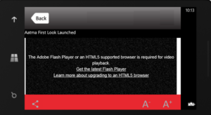
Flash simply isn’t supported on many mobile devices, including all Apple devices. Good bye iPhone users! Use of flash or any other software that isn’t supported by mobile will automatically kick your site out of the “Mobile-Friendly” rankings.
Can you read it?
Having text that is appropriately sized to be viewed without zooming is also extremely important. The mobile user will not tolerate a site where they have to zoom in and out just to get to the information they seek, and as a result, neither will the search engine.
Where did it go?
In addition to size, text must be placed and wrapped in such a way that the user is not required to scroll horizontally to continue reading the text. Often, this text will get cut off entirely, and is a sure-fire way to achieve high bounce rates.
Fat Finger Friendly
While last on the list, this may be the most important as far as the User Experience goes. Action buttons need to walk the fine line between being large enough for anyone to click without zooming, but also spaced appropriately so that the user can be sure to hit the button they intended to hit. This also includes having enough space around buttons to allow for unhindered scrolling. Constantly clicking links while trying to reach the bottom of the page will send most users to another site very quickly!
Implementation
 Implementation of Mobile-Optimization can be done in a variety of ways: multiple URL’s, dynamic serving, and responsive web design. The most basic approach is having multiple URLs, one for mobile sites and one for desktop. Frequently these look like www.yourwebsite.com and m.yourwebsite.com. This requires developing two separate sites and can be a bit onerous for both the designer and the user. Dynamic serving has the same URL for all devices, but the server detects the screen size and device type and provides a different set of HTML depending on the device. While this is better, the preferred approach is to have a responsive web design. In this case, embedded in the code is the ability to reformat and scale your site to the receiving screen size. Search engines rank this approach most highly as it will create the best user experience regardless of device.
Let’s be sure!
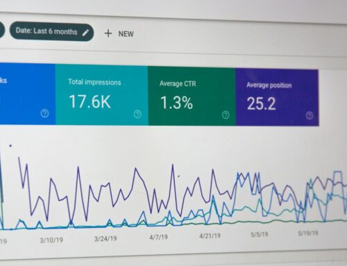
There is one easy way to see what the bots think about your site and your work towards mobile optimization, test it! Head over to Google’s “Mobile-Friendly Test” and see how you stack up. Then, armed with that knowledge you can make any necessary adjustments and enjoy even better SEO than before!
Need assistance setting up your SEO or someone to manage it for you so you can give your business the attention it deserves? We can help, with multiple packages to choose from we have a plan to fit any budget. Contact us for a 45-minute consultation.